When trying to generate fake data for a database performance test, I found myself falling down a rabbit hole researching how to create random variables that fall into a specific probability distribution. Finding myself with a solution but without intuition, I ended up creating an interactive visualizer to help learn more deeply what was going on.
I encourage you to both read on and take the visualizer for a spin!
Generating random data
I was recently writing a blog post how a missing index affects PostgreSQL delete performance when cascade deletes get involved. To get good, comparable query plans — with and without the index — I loaded a minimal set of illustrative tables into a local instance. These tables consisted of users, articles, comments, and the appropriate relationships between them. Then, I began generating large amounts of randomized data.
I started by creating a fixed, but large, number of users. Then, I created a random number articles authored by each user. Finally, I selected a random subset of users to comment on each article a random number of times.
That can generally be good enough to create a mass of data useful enough to illustrate differences in query plans at scale. This technique, using nothing more than generate_series() and random(), can produce millions (or billions) of rows without all that much forethought.
For example, let’s insert somewhere between zero and five hundred articles for every user:
| |
This technique produces random, but incredibly uniform data.
It’s very unlikely that a social media application with any significant number of users will all interact roughly in the same way. In this situation, uniformity seems extremely unnatural. There will be a huge number of lurkers that leave no trace except for the view analytics captured by the backend. There will be a small number of power yappers users who believe their every thought is a necessary gift to the world and dominate the submitted content. The remainder of the users are likely to fall on some sort of bell curve of mid-range interactions.
We can handle the case of lurkers easily by simply setting aside some percentage of users for which we’ll generate no content. To represent the active users, we can generate article and comment counts per user according to a log-normal distribution. This distribution is a good choice as it has a right-skewed spread with a long tail for high-activity users, which works well to model both the majority of users with modest to moderate activity, as well as “Comments Georg” - those who post without bound, sleep, or any reaction to the negative feedback on their hot takes.
For every non-lurking user, we can simply generate log-normally distributed random values to determine how many articles or comments they’ve posted. Slot this value in place of the uniform random() call above, and suddenly we have much more realistic test data to play with.
Generating log-normally distributed random values
In order to generate a log-normally distributed random value, we first generate a normally distributed random value $Z \sim N(\mu, \sigma^2)$, then compute $e^Z$. This makes sense, as the logarithm of a log-normal distribution is normally distributed. We’re just applying this definition in reverse.
There are two tricky things to consider here.
The first is that the values of $\mu$ and $\sigma^2$ here denote the mean and variance of the underlying normal distribution, not the resulting log-normal distribution. What we’d like for our use case of constructing a target distribution is to select a mean $m$ and standard deviation $s$ for the resulting log-normal distribution. These values can then inform the choice of the underlying normal distribution mean and variance to give the resulting distribution the properties we’d like.
By definition, the mean of a log-normal distribution is $m = e^{\mu+\frac{1}{2}\sigma^2}$ and its variance is $s^2 = (e^{\sigma^2} - 1) * m^2$. We can solve for $\sigma^2$ algebraically using the definition of the variance:
$$ \begin{aligned} s^2 &= (e^{\sigma^2} - 1) * m^2 \\ e^{\sigma^2} - 1 &= \frac{s^2}{m^2} \\ e^{\sigma^2} &= 1 + \frac{s^2}{m^2} \\ \sigma^2 &= \ln(1 + \frac{s^2}{m^2}) \end{aligned} $$
We can also solve for $\mu$ algebraically using the definition of the mean:
$$ \begin{aligned} m &= e^{\mu + \frac{1}{2}\sigma^2} \\ \ln(m) &= \mu + \frac{1}{2}\sigma^2 \\ \mu &= \ln(m) - \frac{1}{2}\sigma^2 \end{aligned} $$
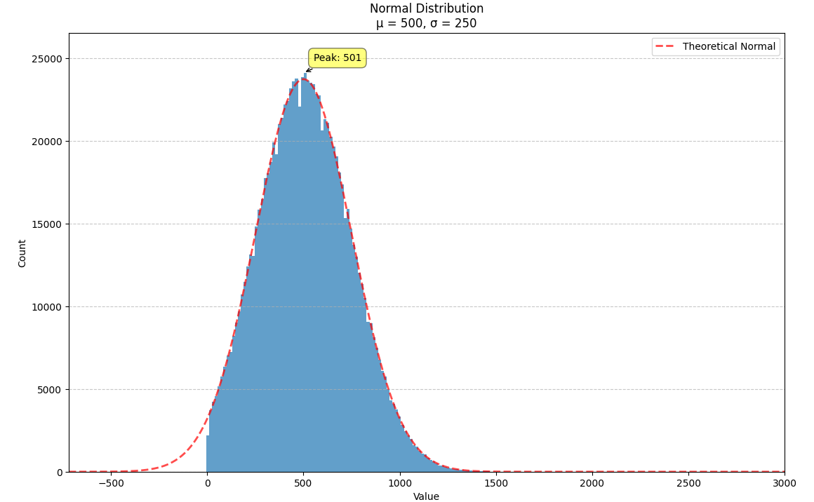
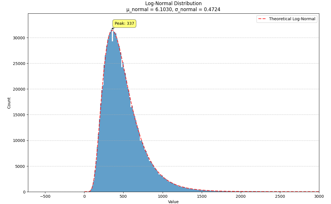
We illustrate this with a normal distribution where $m = 500$ and $s = 250$. We can plug these numbers into the formulae above to get a new normal distribution, $N(6.1030, 0.4724)$, which we can then exponentiate to get a log-normal distribution with the same mean and variance.
The log-normal distribution can be thought of a deformation of the normal distribution that raises the peak up and pulls the right tail out (squishing the right side of the distribution so it decays more steeply). When the variance is small, both distributions approximate one another. When the variance is increased, this deformation becomes more noticeable.
The second tricky thing we must consider is how to to generate a normally distributed random value.
Generating normally distributed random values
If you’re a sensible person, you might spend two seconds on a Google search and find that the generation of a normally distributed random value is not tricky at all and you can simply call the normal_rand() function after installing the built-in and trusted tablefunc extension.
Given this function, the change to our SQL is fairly minimal:
| |
And that should have been the end of the story.
Generating normally distributed random values (the harder way)
If you’re a less sensible person (like I was), you might blindly follow the advice given by OpenAI’s o1-preview and end up implementing a Box-Muller transform by hand (like I did).
Welcome to the rabbit hole.
Given two uniform random values $U_1$ and $U_2$, we can generate a normally distributed random value $n$ with a mean of $\mu$ and a variance of $\sigma^2$:
$$ n = \mu + \sigma * \sqrt{-\ln(U_1) * 2} * \cos(U_2 * 2\pi) $$
Okay…

I successfully Chinese Room’d my way through a rote translation of the scary math symbols $\sqrt{…}$ and $\ln(…)$ 1 into the warm and fuzzy sqrt(...) and ln(...) SQL functions. The resulting data, confirmed by empiric testing stemming from my incredulity, did follow the expected distribution. But I had zero intuition why this was the case.
Squint at things until you “get it”
I kept reading page after page on how the Box-Muller transform works, just waiting for an Aha moment to come to me and for everything to click into place. But it wasn’t coming readily. For me to actually grok this concept, I needed a more hands-on way to explore.
So I built an interactive visualizer where I could control and replace individual sub-expressions of the transformation. I needed the ability to debug the transformation in a way that gave me real-time visual feedback. And this seemed to do the trick.
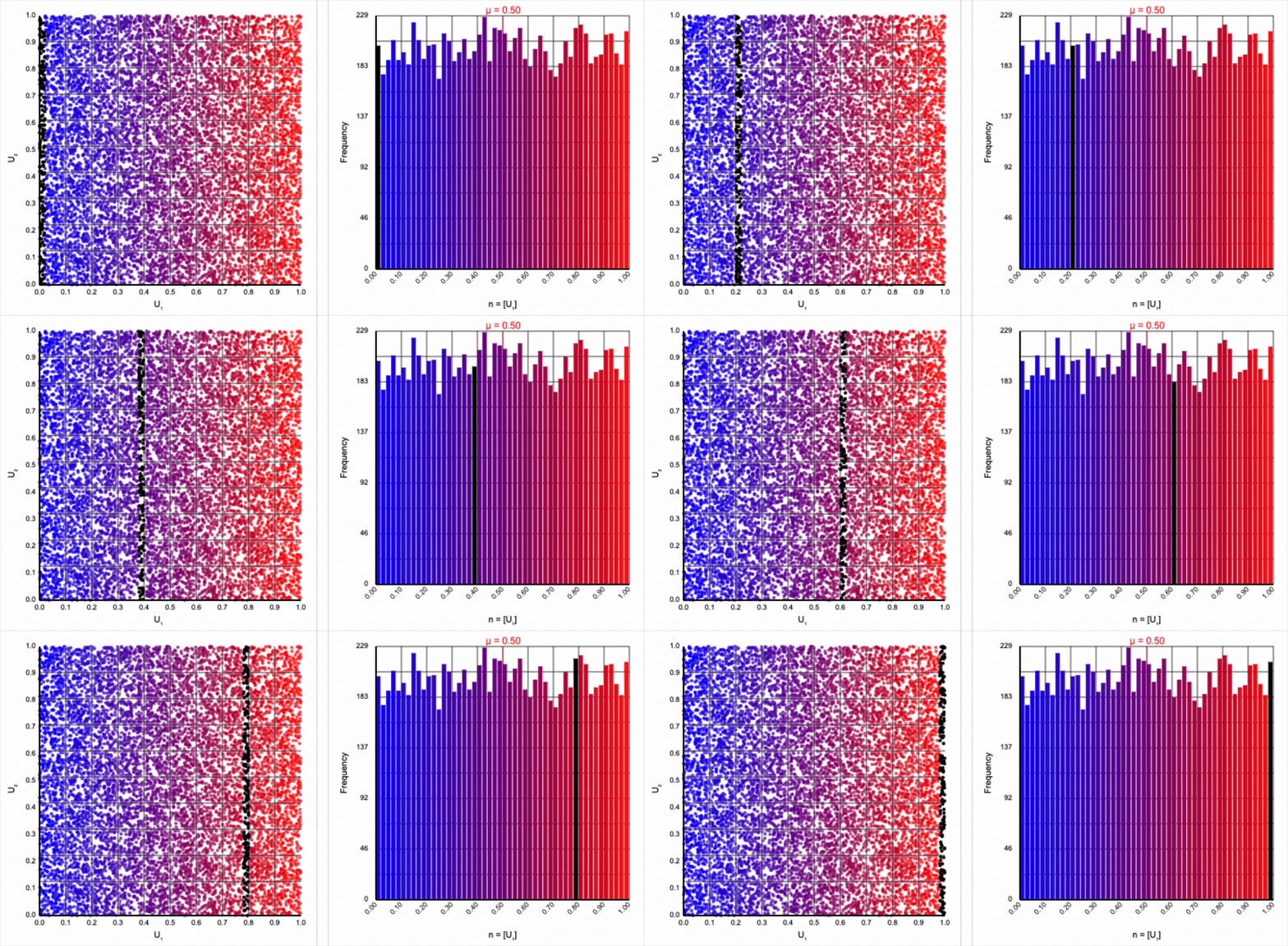
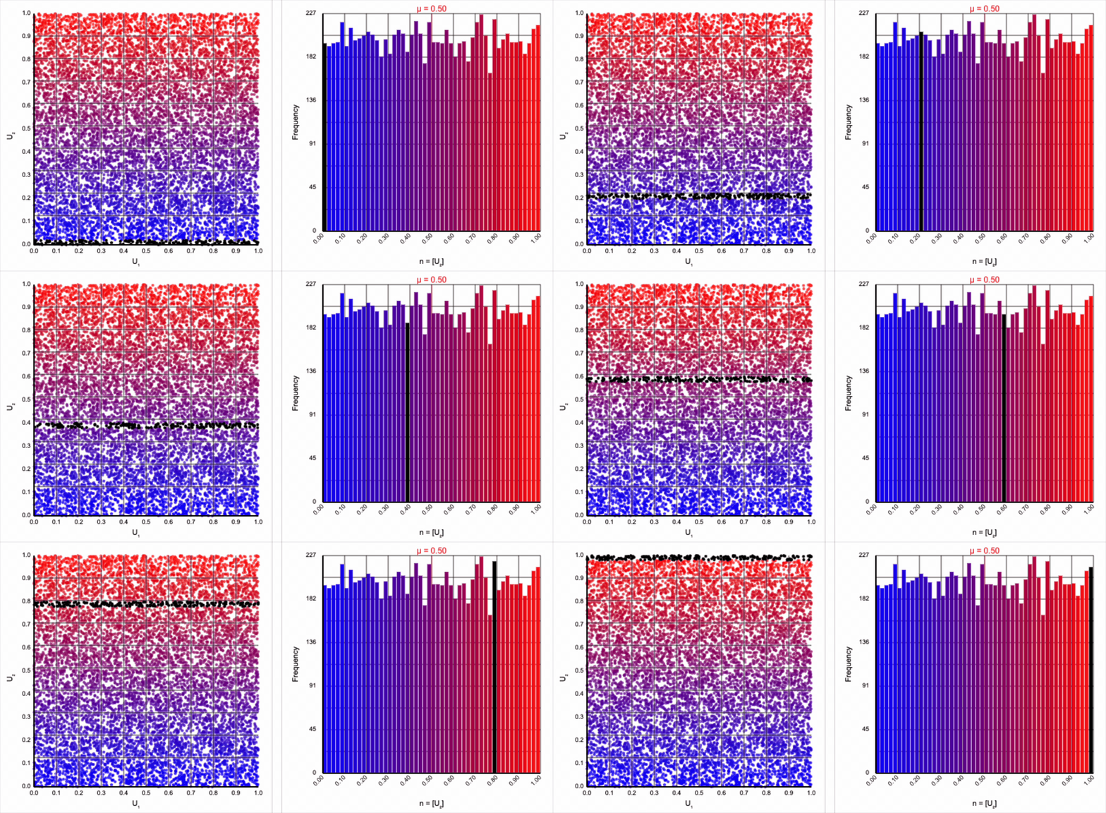
The visualizer generates pairs of uniformly distributed values $(U_1, U_2)$ and plots them as points in the Cartesian coordinate system. Plotting the distribution of either value alone will yield incredibly unsurprising histograms (hint: they’re uniform by construction).
If we look at the expression for generating a standard normal variable using the Box-Muller transform, it resembles converting polar coordinates to its x-coordinate in the Cartesian coordinate system:
$$ r * \cos(\theta) = \sqrt{-\ln(U_1) * 2} * \cos(U_2 * 2\pi) $$
Here, $r$ denotes the radial coordinate (the distance from the pole, or origin), and $\theta$ denotes the angular coordinate (the angle from the polar axis). Given this interpretation, it’s likely we’ll want to visualize the polar interpretation of the points in the Cartesian coordinate system as well.
We now have two questions:
- Why are we projecting into a polar coordinate system in the first place? I’m fairly unpracticed in trigonometry, and the inclusion of its concepts is personally offensive 2. Just be linear!
- Why these particular values for the choice of $r$ and $\theta$?
Let’s take these one at a time.
Polar coordinates
There’s an easy answer to the first question. We are projecting into a polar coordinate system simply because we require either a sine or cosine term to express the normal distribution’s symmetry around its mean. Either of these trigonometric expression works equally well. In fact, the Box-Muller transformation produces two normally distributed values: $z_0 = r * \cos(\theta)$ and $z_1 = r * \sin(\theta)$. We’ve been focusing on only the former, but all the arguments and intuitions also apply to the latter.
We can omit the trigonometric term completely and calculate $U_1 * U_2$, but that will result in a very asymmetric distribution. Values closer to zero are more common as the product is small when either of the multipliers are small. Larger values are less common as there are fewer ways to produce them - both multipliers must be large to produce a value near one. This produces a histogram that peaks at zero and tapers down towards one.


When we include the trigonometric term and calculate $U_1 * \cos(U_2 * 2\pi)$, we end up with a distribution symmetric around zero. This is because these functions maps (about) half of this range of inputs to a positive number, and the other half to a negative number.


This ends up changing the shape of the distribution a bit. Notice that there are both more frequent extremes as well as a greater clustering around zero (and a steeper decay in both directions to make account for it). Sine and cosine have a higher density near $\pm 1$, producing larger values in the distribution when $U_1$ is already large. These functions also have multiple crossings through zero (at $0$, $\pi$, and $2\pi$ for sine and $\frac{1}{2}\pi$ and $\frac{3}{2}\pi$ for cosine), which will tend to pull more values towards zero compared to a uniform multiplier.
It’s worth noting that scaling $U_2$ by a factor of $2\pi$ (or any of its multiples) is necessary. Otherwise, we’d be exercising a partial period of the trigonometric function. If we calculate something like $U_1 * \cos(U_2)$, we see that we lose the symmetry.


This cosine term gives us the general symmetric shape we’re looking for in a normal distribution, but it alone doesn’t give us the correct spread of values.
Controlling the spread
We now need to discover why this choice of $r$ produces a normal distribution.
Let’s start by analyzing the natural logarithm term by itself. The magnitude of values produced by $\ln(U_1)$ are small when $U_1$ approaches one and steeply increase towards infinity when $U_1$ approaches zero.
Note that because $U_1 \le 1$ by definition, all values produced by $\ln(U_1)$ are non-positive. As we’re interpreting $r$ as a distance from the origin, negative values don’t make any sense. We can use just the magnitude from this term by taking the absolute value or, equivalently, flipping the sign so that all negative values become positive values with the same magnitude.
Then, $r = -\ln(U_1)$ yields the following distribution.


This term introduces an exponential decay in which most values of $U_1$ cluster around zero, but a small number of values will find themselves farther away from the origin. This matches the “fat tail” of the normal distribution, which extend outwards with decreasing likelihood. When we re-introduce the $\cos(\theta)$ term to the distribution, we see something familiar beginning to take shape.


We have a general outline of a normal distribution (when you squint), and the mean and variance seem to match what we want for a standard normal distribution ($\mu = 0$ and $\sigma^2 = 1$). But it’s not a normal distribution - the tails are far too chonky.
I’ve added markers for the 10th and 90th percentiles of the distribution to help illustrate. According to the standard normal distribution’s quantile function, $\Phi^{-1}$, percentiles should have the approximate values of $\pm 1.28$. For the distribution above, our values are approximately $\pm 1.07$.
We need to squish the distribution back towards the mean so that extreme values are less likely. Let’s compress the distribution by adding the square root term, so that $r = \sqrt{-\ln(U_1)}$.


If you compare the polar coordinate systems from the previous two distributions, you can see visually that we’ve cranked up the gravity at the origin and sucked all the values (including the extreme ones) back towards the center. The resulting distribution now looks such more correct, and the 10th and 90th percentiles are in the correct place. Unfortunately, by changing the behavior of the spread we’ve also altered our variance away from our target.
Thankfully, the change in variance is a simple fix. We need to include a constant factor of $\sqrt{2}$. When we set $r = \sqrt{-\ln(U_1) * 2}$, we finally achieve our target standard normal distribution.


A bit of additional precision
I found the visualizations and the comparison between behaviors when partial terms were omitted to be helpful to understand how each part individually contributes to the final distribution.
But some of the choices still seem odd. Why choose the natural logarithm and square root when there may be other logarithmic bases or exponents to choose from to accomplish the same fuzzy tasks? For a more rigorous explanation, we can take a look at the standard normal distribution’s probability density function, which includes an exact exponential decay.
The probability of the absolute value of a standard normal random variable $n$ exceeding some value $x$ is proportional to this exponential decay.
$$ P(\lvert n \rvert > x) \propto e^{-\frac{1}{2}x^2} $$
We can then derive $r$ directly from this expression.
$$ \begin{aligned} e^{-\frac{1}{2}r^2} &= U_1 \\ -\frac{1}{2}r^2 &= \ln(U_1) \\ r^2 &= -\ln(U_1) * 2 \\ r &= \sqrt{-\ln(U_1) * 2} \end{aligned} $$
And that’s it! Or just call normal_rand(). But this was cool too.


